![[background image] image of art supplies on a desk (for a graphic design studio)](../../images/memo-mock-1.webp)

The challenge
MeMo Accounting is a small, personal accounting firm run by Mojca. A dedicated professional who built her business on trust, attention to detail, and genuine care for her clients.
But her digital presence told a different story.
No website. Generic materials. A brand that looked like every other accounting firm — blue, grey, forgettable. In a market dominated by larger firms with bigger budgets, Mojca struggled to stand out and communicate the quality of her work.
She knew what she offered. Her clients knew. But nobody else could see it.
The new brand transformed how potential clients see my business. Now I'm proud to share my website with everyone and finally feel confident handing out my business card.
The solution
A complete brand identity and responsive Webflow website, designed to make MeMo Accounting impossible to ignore.
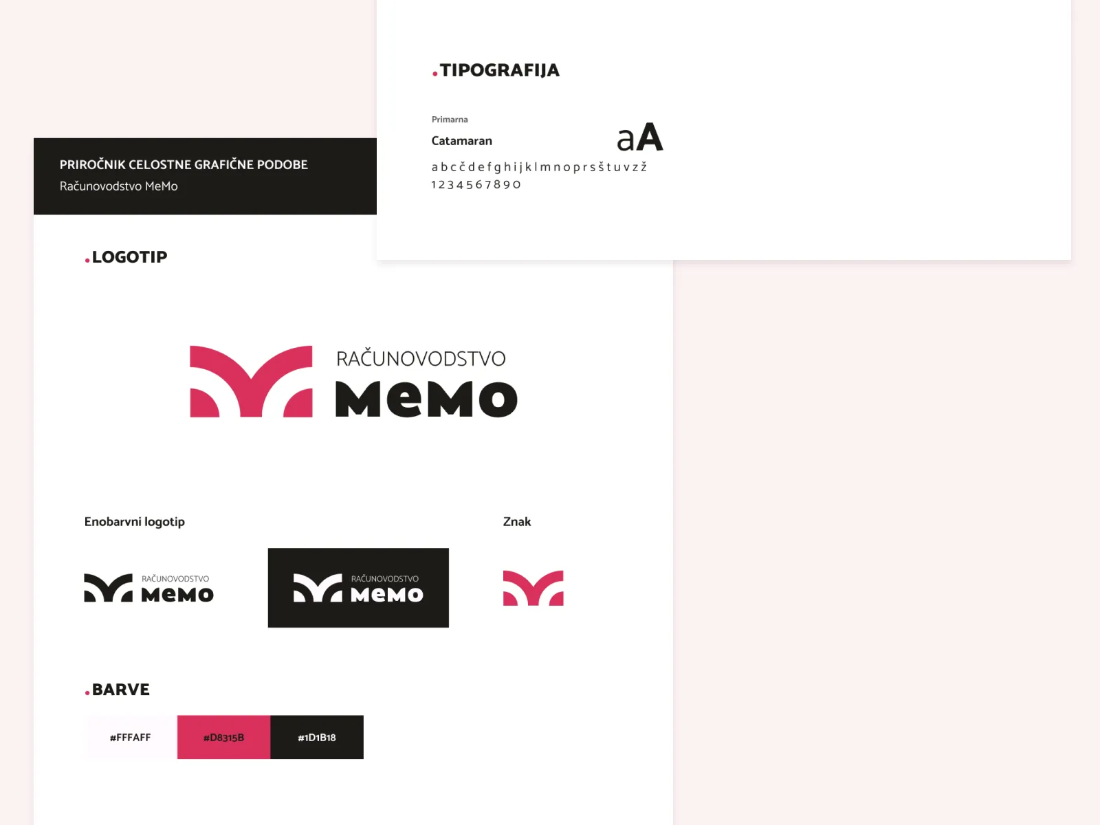
Brand Identity
The brief was clear: modern, approachable, memorable. Not another blue accounting firm.
The answer was bold pink — #D8315B.
In an industry built on grey suits and conservative palettes, pink was a deliberate choice. It signals: modern, not outdated. Personal, not corporate. Approachable, not intimidating. Memorable in a traditional industry.
Paired with dark charcoal #1D1B18, the palette balances energy with professionalism, perfect for a firm targeting small businesses and female entrepreneurs.
The logo, a stylised "M" forming an open book shape — combines the precision of accounting with the openness of knowledge. Clean, modern, instantly recognisable.
Typography: Catamaran — clean, modern, readable on every device.
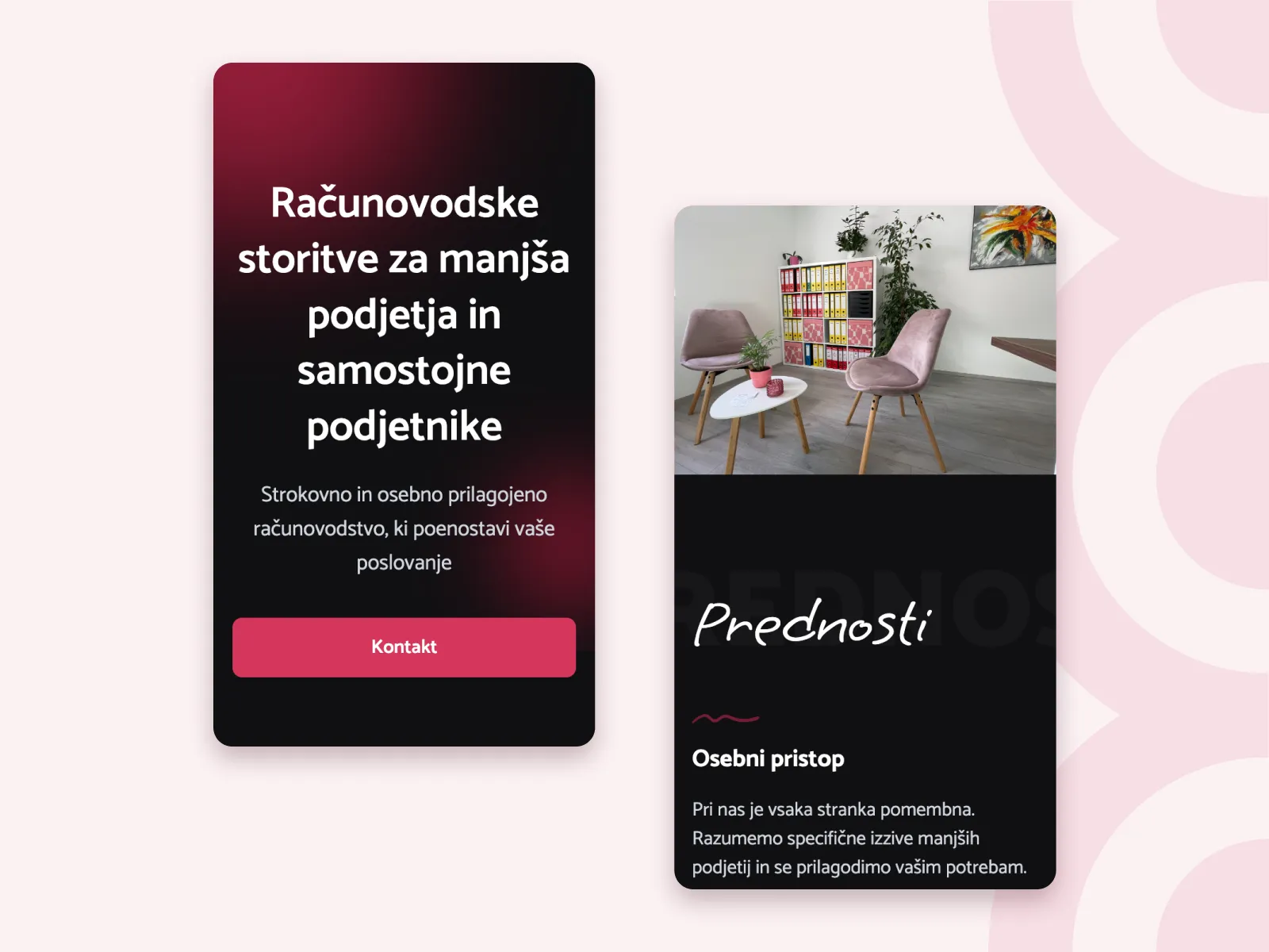
Website
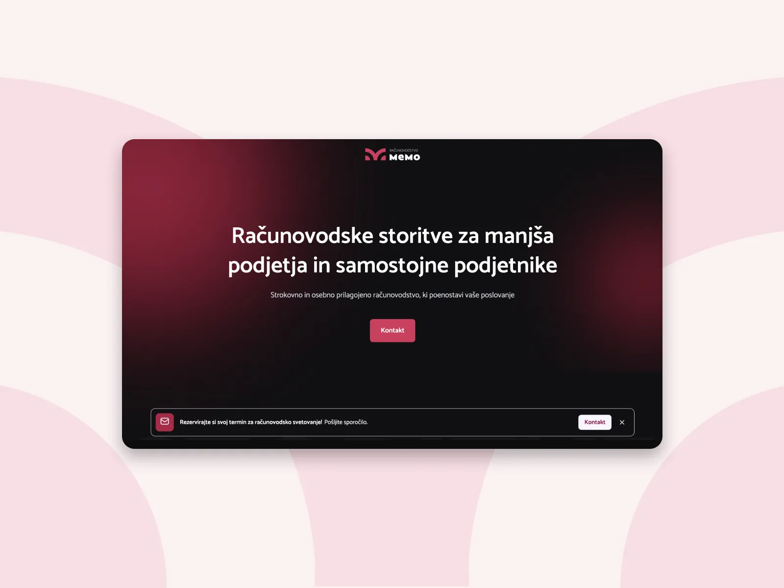
The page is built around one principle: remove every barrier between the visitor and getting in touch.
Hero answers who is this for immediately. Services come before anything else — because that's the first question every visitor asks. The CTA appears mid-page so visitors who already know what they need don't have to scroll to act. The office photo builds trust through reality — a real space, a real person. Benefits address the unspoken fears of a small business owner. Contact closes simply, with no friction.
Built in Webflow, mobile-first. Fast, accessible, and easy to manage independently.
Every section moves the visitor one step forward. Nothing is there to fill space.
The result
MeMo Accounting now has a brand that attracts small businesses and female entrepreneurs, the exact clients Mojca wanted to reach.
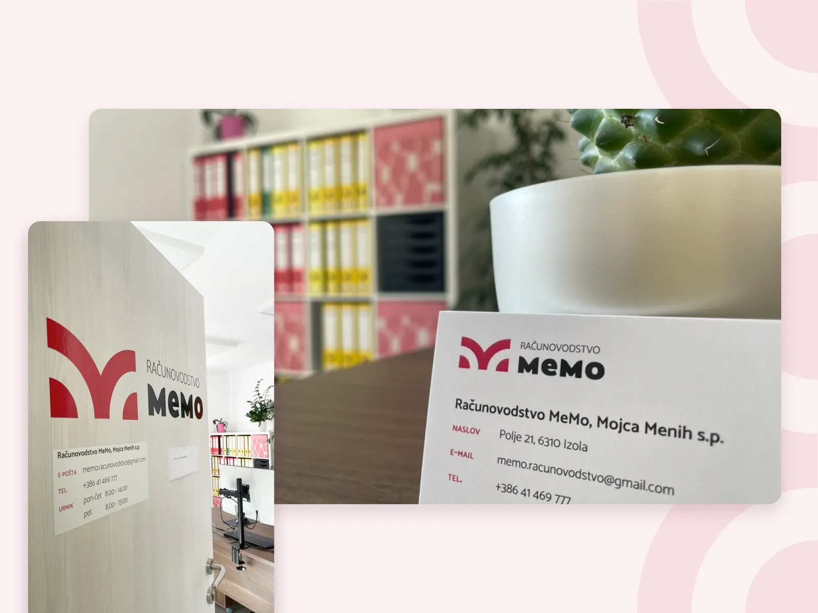
She competes confidently with larger firms. Her materials are consistent across every touchpoint. And when she hands someone her business card or shares her website link, she feels proud to do it.
What we delivered
Logo system · Colour palette · Typography · Brand guidelines · Responsive Webflow website · Local SEO setup · Mobile optimisation · Contact forms · Training